Cookbook
How to use refs in examples?
Use ref prop as a function and assign a reference to a local variable:
const [value, setValue] = React.useState('')
let textarea
;<div>
  <Button onClick={() => textarea.insertAtCursor('Pizza')}>
    Insert
  </Button>
  <Textarea
    value={value}
    onChange={e => setValue(e.target.value)}
    ref={ref => (textarea = ref)}
  />
</div>
How to exclude some components from style guide?
Styleguidist will ignore tests (__tests__ folder and filenames containing .test.js or .spec.js) by default.
Use ignore option to customize this behavior:
module.exports = {
  ignore: ['**/*.spec.js', '**/components/Button.js']
}
You should pass glob patterns, for example, use **/components/Button.js instead of components/Button.js.
How to hide some components in style guide but make them available in examples?
Enable skipComponentsWithoutExample option and do not add an example file (Readme.md by default) to components you want to ignore.
Import these components in your examples:
// ```jsx inside Markdown
import Button from '../common/Button'
;<Button>Push Me Tender</Button>
Or, to make these components available for all examples:
// styleguide.config.js
module.exports = {
  require: [path.resolve(__dirname, 'styleguide/setup.js')]
}

// styleguide/setup.js
import Button from './src/components/common/Button'
global.Button = Button
The Button component will be available in every example without a need to import it.
How to render React components that aren’t part of the style guide?
Import these components in your examples:
// ```jsx or ```jsx noeditor inside Markdown
import ColorPalette from './components/ColorPalette'
;<ColorPalette />
How to dynamically load other components in an example?
Although examples don’t have direct access to Vite’s import.meta.glob feature, you can use it in a separate helper file which you import in your example code. If you wanted to create an example to load and show all your icon components, you could do this:
// load-icons.js
const modules = import.meta.glob('./icons/**/*.js', { eager: true })
const icons = Object.keys(modules).reduce((icons, file) => {
  const Icon = modules[file].default
  const label = file.slice(8, -3) // strip './icons/' and '.js'
  icons[label] = Icon
  return icons
}, {})

export default icons
// ```jsx or ```jsx noeditor inside Markdown
import icons from './load-icons'
const iconElements = Object.keys(icons).map(iconName => {
  const Icon = icons[iconName]
  return (
    <span key={iconName}>
      {iconName}: {<Icon />}
    </span>
  )
})
<div>{iconElements}</div>
How to display the source code of any file?
First, code examples can receive props and settings:
The above example adds a setting called file with the relative path to the file we want to display as value.
Second, use the updateExample config option, to detect the setting and change the content of a fenced code block:
module.exports = {
  updateExample(props, exampleFilePath) {
    // props.settings are passed by any fenced code block, in this case
    const { settings, lang } = props
    // "../mySourceCode.js"
    if (typeof settings.file === 'string') {
      // "absolute path to mySourceCode.js"
      const filepath = path.resolve(
        path.dirname(exampleFilePath),
        settings.file
      )
      // displays the block as static code
      settings.static = true
      // no longer needed
      delete settings.file
      return {
        content: fs.readFileSync(filepath, 'utf8'),
        settings,
        lang
      }
    }
    return props
  }
}
How do I write examples in MDX?
Install the two optional dependencies:
npm install --save-dev @mdx-js/mdx remark-gfm
Then name the file .mdx instead of .md. Readme.mdx next to a component, ComponentName.mdx, an .mdx path in sections[].content or in an @example doclet — all of them are picked up by their extension, and nothing else in the config changes:
module.exports = {
  sections: [
    { name: 'Introduction', content: 'docs/Intro.mdx' },
    { name: 'Components', components: 'src/components/**/[A-Z]*.js' }
  ]
}
Fences work exactly as in Markdown — the same playground languages, the same padded, noeditor, static and JSON settings modifiers — and the prose around them can use components:
import Callout from '../../docs/Callout'

`Button` is the only true button.

<Callout kind="warning">
  Use one primary button per screen.
</Callout>

```jsx
<Button>Push Me</Button>
```

| `size`   | Font size |
| -------- | --------- |
| `small`  | 10px      |
| `normal` | 14px      |
Three things are worth knowing before you write the first page:
- MDX is not Markdown. An indented block is not a code block, HTML comments and non-self-closing void elements are compile errors, and a curly brace in prose starts a JavaScript expression. The full list is in MDX is not Markdown.
- Page imports and playground imports are different scopes.
import Callout from './Callout'at the top of the page is for the prose; a playground still imports what it needs inside its own fence. - GFM is on by default. Tables, task lists and strikethrough work because
remark-gfmis enabled; if you set mdx.remarkPlugins you replace that default and have to list it again.
To share a component between pages without importing it in each one, register it with mdxComponents:
module.exports = {
  mdxComponents: {
    // Path to the module that default-exports the component, relative to this config file
    Callout: 'styleguide/components/Callout'
  }
}
Every .mdx page can then write <Callout> without importing it.
A complete style guide doing all of this — MDX component pages, an MDX section page, and one component still documented in Readme.md — is in the MDX example.
How to set global styles for user components?
Using the jss-global API you can set global styles in your config:
module.exports = {
  components: 'src/components/**/[A-Z]*.js',
  styles: {
    StyleGuide: {
      '@global body': {
        fontFamily: 'Helvetica'
      }
    }
  }
}
Above, we have set font-family: 'Helvetica'; on the body.
This does not set styles on the style guide UI, for that read How to change styles of a style guide.
How to add custom JavaScript and CSS or polyfills?
In your style guide config:
const path = require('path')
module.exports = {
  require: [
    'core-js/stable',
    path.join(__dirname, 'path/to/script.js'),
    path.join(__dirname, 'path/to/styles.css')
  ]
}
CSS, Sass and other files Vite understands don’t need any extra configuration.
How to use Styleguidist with Preact?
You need to alias react and react-dom to preact/compat:
module.exports = {
  viteConfig: {
    resolve: {
      alias: {
        react: 'preact/compat',
        'react-dom': 'preact/compat'
      }
    }
  }
}
The aliases also cover react-dom/client and react/jsx-runtime, which resolve to preact/compat/client and preact/compat/jsx-runtime. Keep the plain react-dom alias too: when the project’s react-dom is 16 or 17 the style guide is mounted through react-dom’s render, which preact/compat provides as well; without a react-dom in the project it uses createRoot through the react-dom/client alias.
See the Preact example style guide.
How to change styles of a style guide?
There are two config options to change your style guide UI: theme and styles.
Use theme to change fonts, colors, etc.
Use styles to tweak the style of any particular Styleguidist component.
As an example:
module.exports = {
  theme: {
    color: {
      link: 'firebrick',
      linkHover: 'salmon'
    },
    fontFamily: {
      base: '"Comic Sans MS", "Comic Sans", cursive'
    }
  },
  styles: {
    Logo: {
      // We're changing the LogoRenderer component
      logo: {
        // We're changing the rsg--logo-XX class name inside the component
        animation: '$blink ease-in-out 300ms infinite'
      },
      '@keyframes blink': {
        to: { opacity: 0 }
      }
    }
  }
}
See available theme variables. Colour tokens are CSS custom properties that switch with dark mode; overriding one through theme gives you a fixed colour in both schemes.
Styles use JSS with these plugins: jss-isolate, jss-nested, jss-camel-case, jss-default-unit, jss-compose and jss-global.
Use React Developer Tools to find component and style names. For example a component <LogoRenderer><h1 className="rsg--logo-1234567890"> corresponds to an example above (the number is derived from the component, all its classes share it).
Use a function instead of an object for styles to access all theme variables in your custom styles.
You can store all styles in a separate file to allow hot module replacement (HMR). Same goes for theme variables.
The same example above would then translate as:
In styleguide.config.js, objects are replaced with file paths
module.exports = {
  // ...
  styles: './styleguide/styles.js',
  theme: './styleguide/theme.js'
}
then in ./styleguide/theme.js
export default {
  color: {
    link: 'firebrick',
    linkHover: 'salmon'
  },
  fontFamily: {
    base: '"Comic Sans MS", "Comic Sans", cursive'
  }
}
and in ./styleguide/styles.js
export default {
  Logo: {
    // We're changing the LogoRenderer component
    logo: {
      // We're changing the rsg--logo-XX class name inside the component
      animation: '$blink ease-in-out 300ms infinite'
    },
    '@keyframes blink': {
      to: { opacity: 0 }
    }
  }
}
Each modification of theme.js or styles.js will trigger a hot module replacement, updating the styleguide in the browser.
These files are bundled for the browser and must be ES modules (export default), module.exports won’t work.
Check out the themed example to learn more and try it out.
module.exports = {
  styles: function (theme) {
    return {
      Logo: {
        logo: {
          // we can now change the color used in the logo item to use the theme's `link` color
          color: theme.color.link
        }
      }
    }
  }
}
How to customize dark mode?
The style guide UI has a light and a dark scheme. By default (colorScheme system) it follows the visitor’s operating system and shows a system / light / dark toggle in the sidebar header; the choice is remembered in localStorage and applied before the first paint. Your components are not restyled: they render with their own CSS, inside a frame that is light or dark.
To start every visitor in one scheme and remove the toggle:
module.exports = {
  colorScheme: 'dark'
}
Colours are CSS custom properties named after the theme tokens (color.sidebarBackground is --rsg-color-sidebar-background), so a colour that should differ between the schemes is set on :root (light), on [data-rsg-theme="dark"] (the toggle’s dark choice) and inside the prefers-color-scheme media query (the system setting). The easiest place is an inline style in template:
module.exports = {
  template: {
    head: {
      raw: `<style>
  :root { --rsg-color-sidebar-background: #f0f4f8; }
  [data-rsg-theme="dark"] { --rsg-color-sidebar-background: #0b1620; }
  @media (prefers-color-scheme: dark) {
    :root:not([data-rsg-theme="light"]) { --rsg-color-sidebar-background: #0b1620; }
  }
</style>`
    }
  }
}
A stylesheet listed in require works the same way. Do not set such colours through theme.color.*: that replaces the custom property with a literal, and the token stops switching. theme.color.* is the right tool when you want one colour in both schemes, or when you set colorScheme to light or dark.
The toggle is the ThemeToggle component: restyle it with styles: { ThemeToggle: { root: {…}, button: {…}, isActive: {…} } }, or replace ThemeToggleRenderer through styleguideComponents (it receives value, one of system, light, dark, and onChange). A custom StyleGuideRenderer can import it from vite-styleguidist/lib/client/rsg-components/ThemeToggle/index.js and place it anywhere.
If you use a template function, keep the <meta name="color-scheme"> tag and the inline script that applies the stored choice, otherwise the page renders light first and switches once the bundle runs:
const {
  colorSchemeScript
} = require('vite-styleguidist/lib/vite/html.js')

module.exports = {
  template({ colorScheme, title, container, publicPath, js, css }) {
    return `<!DOCTYPE html>
<html>
<head>
<meta charset="utf-8">
<meta name="color-scheme" content="${
      colorScheme === 'system' ? 'light dark' : colorScheme
    }">
<script>${colorSchemeScript(colorScheme)}</script>
<title>${title}</title>
${css
  .map(file => `<link rel="stylesheet" href="${publicPath}${file}">`)
  .join('')}
</head>
<body><div id="${container}"></div>${js
      .map(
        file =>
          `<script type="module" src="${publicPath}${file}"></script>`
      )
      .join('')}</body>
</html>`
  }
}
How to make my components follow the style guide’s colour scheme?
Your components are yours: Styleguidist renders them with their own CSS and never restyles them, so a library with a fixed palette is a perfectly good style guide. This recipe is optional, and it only changes how your components look inside the style guide — but a component that hard-codes color: #333; background: #fff is unreadable on the dark page, which is what every example in this repository used to do.
Every colour of the style guide is a CSS custom property named after its theme token, --rsg-color-<name> with the token name in kebab-case, defined for both schemes on the page your components render in. Reading one is all it takes to follow the light/dark toggle:
.button {
  /* the value after the comma is the light-scheme fallback, used wherever the
     style guide is not around: this component inside your app, or a unit test */
  color: var(--rsg-color-light, #625d57);
  background-color: var(--rsg-color-base-background, #fcfbf9);
  border: 1px solid currentColor;
}
It works in a CSS Module (custom properties are global, only the class name is scoped), in an inline style, and in any CSS-in-JS library, because a var() expression is a plain CSS value:
<label style={{ color: 'var(--rsg-color-base, #262421)' }}>Hi</label>
These are the properties, with their light and dark values. Names are only ever added, never renamed or removed (see ADR 0011):
| Custom property | Light | Dark | Role |
|---|---|---|---|
--rsg-color-base | #262421 | #ece8e1 | body text |
--rsg-color-light | #625d57 | #a8a29a | secondary text |
--rsg-color-lightest | #a8a29a | #6b6660 | decorative: placeholders, disabled marks |
--rsg-color-link | #0b7285 | #5cc8d8 | links, the single accent |
--rsg-color-link-hover | #095c6b | #8fdde8 | hovered links |
--rsg-color-focus | rgba(11, 114, 133, 0.3) | rgba(92, 200, 216, 0.35) | focus ring |
--rsg-color-border | #e6e2da | #3a3631 | decorative: rules, boxes |
--rsg-color-name | #4a6b1f | #a3d17a | prop names |
--rsg-color-type | #8c1f5a | #e59fc7 | prop types |
--rsg-color-error | #b42318 | #f28b82 | error text |
--rsg-color-base-background | #fcfbf9 | #1c1a17 | the page, and the example preview box |
--rsg-color-code-background | #f3f1ec | #262320 | code blocks, a quiet raised surface |
--rsg-color-sidebar-background | #f4f2ee | #221f1b | the sidebar |
--rsg-color-selected-background | #e3f1f3 | #1f3236 | the selected sidebar item, the active tab |
--rsg-color-error-background | #fdf3f1 | #2b1f1d | the playground error panel |
--rsg-color-ribbon-background | #0b7285 | #5cc8d8 | the corner ribbon |
--rsg-color-ribbon-text | #ffffff | #1c1a17 | the corner ribbon’s text |
--rsg-color-code-base | #262421 | #ece8e1 | syntax highlighting: plain code |
--rsg-color-code-comment | #6b6660 | #948d84 | syntax highlighting: comments |
--rsg-color-code-punctuation | #6f6961 | #a8a29a | syntax highlighting: punctuation |
--rsg-color-code-property | #8c1f5a | #e59fc7 | syntax highlighting: properties |
--rsg-color-code-deleted | #8c1f5a | #e59fc7 | syntax highlighting: deletions |
--rsg-color-code-string | #4a6b1f | #a3d17a | syntax highlighting: strings |
--rsg-color-code-inserted | #4a6b1f | #a3d17a | syntax highlighting: insertions |
--rsg-color-code-operator | #8a5a2b | #d9a66b | syntax highlighting: operators |
--rsg-color-code-keyword | #0b7285 | #5cc8d8 | syntax highlighting: keywords |
--rsg-color-code-function | #b3365f | #f28fb1 | syntax highlighting: functions |
--rsg-color-code-variable | #a15c00 | #e8b04a | syntax highlighting: variables |
Colours of your own
A brand colour is not a style guide token and should not be replaced by one. Give it a value per scheme instead, in the same three places Styleguidist declares its own — :root, the attribute the toggle sets, and the media query for visitors who have made no choice:
:root {
  --badge-success-ink: #1c6b30;
  --badge-success-surface: #e2f5e6;
}
[data-rsg-theme='dark'] {
  --badge-success-ink: #8fd8a0;
  --badge-success-surface: #16301d;
}
@media (prefers-color-scheme: dark) {
  :root:not([data-rsg-theme='light']) {
    --badge-success-ink: #8fd8a0;
    --badge-success-surface: #16301d;
  }
}
Use a prefix of your own, as above: --rsg-color-* are Styleguidist’s tokens and it sets them.
You often need neither. A colour that comes with its own background — a filled button, a badge, a banner — is a self-contained pair: it does not depend on the page behind it, so one value works in both schemes. Only a colour that sits directly on the page needs two.
A colour that has to clear WCAG AA (4.5:1 for text, 3:1 for large text and UI boundaries) on both #fcfbf9 and #1c1a17 does not exist: the two requirements have no overlap. One literal on a surface that switches is always wrong in one of the schemes — that is the whole reason for the two values above.
If you do not want two schemes
Set colorScheme to light or dark. The toggle disappears, the page stays in that scheme, and literals in your components are then correct by construction. examples/customised in this repository does exactly that; examples/themed takes the other road and gives its palette a value per scheme.
Note that overriding a colour through the theme option (theme: { color: { link: '#f50' } }) replaces the custom property with a literal for the style guide’s own UI, but does not change --rsg-color-link — a component of yours reading that property still gets Styleguidist’s value. Set both, or set the property alone and leave theme.color untouched; How to customize dark mode? has the details.
How to use CSS animations in your style guide?
As seen in the @keyframes animation examples above, the animation property in CSS rules do not directly use the name of their keyframe animations because of internal keyframe scoping.
To use a CSS animation, you have to define its keyframe at the root of the renderer object. The use of @keyframes in styling above are good examples of this.
How to change the layout of a style guide?
You can replace any Styleguidist React component. But in most of the cases you’ll want to replace *Renderer components — all HTML is rendered by these components. For example ReactComponentRenderer, ComponentsListRenderer, PropsRenderer, DocsLoadingRenderer, etc. — check the source to see what components are available.
Every path in the recipes below is written without a file extension, which is fine: a styleguideComponents value is resolved like any other import, so path.join(__dirname, 'src/styleguide/Wrapper'), './src/styleguide/Wrapper' (relative to the config file) and the same paths with .js all work. The same goes for a component of Styleguidist’s own that you import to wrap it: vite-styleguidist/lib/client/rsg-components/Sections/SectionsRenderer, with or without the .js.
If you replace StyleGuideRenderer, know that on small screens the table of contents collapses behind the menu button through rsg-components/StyleGuide/SidebarContext (the default renderer provides it); without the provider the navigation is simply always open, and the menu and search buttons of the small-screen header are the default renderer’s.
There’s also a special wrapper component — Wrapper — that wraps every example component. By default, it renders children as is but you can use it to provide custom logic.
For example, you can replace the Wrapper component to wrap any example in the React Intl’s provider component. You can’t wrap the whole style guide because every example is compiled separately in a browser.
// styleguide.config.js
const path = require('path')
module.exports = {
  styleguideComponents: {
    Wrapper: path.join(__dirname, 'src/styleguide/Wrapper')
  }
}
// src/styleguide/Wrapper.js
import React, { Component } from 'react'
import { IntlProvider } from 'react-intl'
export default class Wrapper extends Component {
  render() {
    return (
      <IntlProvider locale="en">{this.props.children}</IntlProvider>
    )
  }
}
You can replace the StyleGuideRenderer component like this:
// styleguide.config.js
const path = require('path')
module.exports = {
  styleguideComponents: {
    StyleGuideRenderer: path.join(
      __dirname,
      'src/styleguide/StyleGuideRenderer'
    )
  }
}
// src/styleguide/StyleGuideRenderer.js
import React from 'react'
import Markdown from 'rsg-components/Markdown'

const StyleGuideRenderer = ({
  title,
  version,
  homepageUrl,
  children,
  toc,
  pageNav,
  hasSidebar
}) => (
  <div className="root">
    <h1>{title}</h1>
    {version && <h2>{version}</h2>}
    <main className="wrapper">
      <div className="content">
        {pageNav}
        {children}
        <footer className="footer">
          <Markdown
            text={`Created with [Vite Styleguidist](${homepageUrl})`}
          />
        </footer>
      </div>
      {hasSidebar && <div className="sidebar">{toc}</div>}
    </main>
  </div>
)

export default StyleGuideRenderer
The documentation itself arrives as children; toc is the sidebar and pageNav the “on this page” list of the current page’s headings (pageNav, empty unless the option is on). A slot you do not render is simply gone from your style guide.
We have an example style guide with custom components.
How to change the “on this page” navigation?
The list of the current page’s headings that pageNav adds is two components, like every other part of the UI: PageNav collects the headings and decides what is current, PageNavRenderer draws them. Replace either one through styleguideComponents.
To keep the behaviour and change only the markup, replace the renderer:
// styleguide.config.js
const path = require('path')
module.exports = {
  pageNav: true,
  styleguideComponents: {
    PageNavRenderer: path.join(
      __dirname,
      'src/styleguide/PageNavRenderer'
    )
  }
}
// src/styleguide/PageNavRenderer.js
import React from 'react'
export default function PageNavRenderer({
  headings,
  activeId,
  title,
  collapsible,
  onHeadingClick
}) {
  return (
    <nav aria-label={title}>
      <b>{title}</b>
      <ul>
        {headings.map(heading => (
          <li key={heading.id} data-level={heading.level}>
            <a
              href={heading.href}
              onClick={onHeadingClick}
              aria-current={
                heading.id === activeId ? 'location' : undefined
              }
            >
              {heading.text}
            </a>
          </li>
        ))}
      </ul>
    </nav>
  )
}
The props are:
| Prop | Type | What it is |
|---|---|---|
headings | array | One entry per heading of the page, in document order. Each has an id (the heading’s DOM id), text, level (2 or 3) and href. |
activeId | string | The id of the heading the reader is looking at, or undefined before the page has been scrolled. It changes as the reader scrolls. |
title | string | The label of the list, On this page. |
collapsible | boolean | true when the window is narrower than the mq.large breakpoint, where the default renderer draws a closed details block instead of a rail. |
onHeadingClick | function | Put it on each entry’s link as its onClick. It is what makes a second click on the entry the reader is already on scroll back to that heading: such a click cannot change the address, so the browser fires no hashchange, and nothing else scrolls these links. A renderer that leaves it out loses only that. |
Use heading.href rather than building #id yourself: on a pagePerSection or isolated page the fragment of the address is the route, so an in-page link has to keep it and pass the target in the id parameter, which is what href already does.
The renderer is only rendered when there is something to show — a page with fewer than two headings renders nothing at all — so it never has to handle an empty list.
Replacing PageNav instead replaces the whole feature, including where the headings come from; it is rendered with a title prop and is expected to render nothing when it has nothing to say (an empty slot collapses, and the space the rail would take stays reserved, so the content column keeps its position from page to page). If you also replace StyleGuideRenderer, render its pageNav prop where the list belongs, the same way you render toc.
To keep the components and restyle them, use the styles option with the PageNav key and its rule names — root, title, list, item, link, isSelected (the current entry), isChild (an h3 entry), isCollapsible, details and summary:
module.exports = {
  styles: {
    PageNav: {
      link: {
        fontSize: 14
      }
    }
  }
}
How to change syntax highlighting colors?
Styleguidist uses Prism to highlight static code blocks (in Markdown and in the “Usage” tab) and CodeMirror in the live code editor. Both are colored by the same palette, the theme.color.code* keys: the editor emits Prism’s token class names, so a change to these colors applies to static blocks and to the editor alike. You can change the colors using the theme config option (these values then apply in both light and dark mode; override the --rsg-color-code-* custom properties instead to give each scheme its own colors):
// styleguide.config.js
module.exports = {
  theme: {
    color: {
      codeComment: '#6d6d6d',
      codePunctuation: '#999',
      codeProperty: '#905',
      codeDeleted: '#905',
      codeString: '#690',
      codeInserted: '#690',
      codeOperator: '#9a6e3a',
      codeKeyword: '#1673b1',
      codeFunction: '#DD4A68',
      codeVariable: '#e90'
    }
  }
}
codeBase is the color of plain text, codeBackground the background of code blocks and the editor.
How to replace the code editor?
The live editor under each example is CodeMirror 6 by default (see styleguideComponents.Editor for what it supports and the exact props). If you want something else — a plain text area, Monaco, an editor from your own design system — point styleguideComponents.Editor to your component. The default editor is loaded on demand from the rsg-components/Editor module, so when you replace it CodeMirror isn’t bundled at all.
The component gets the current code and must call onChange with the whole source after every change; Styleguidist debounces the calls by previewDelay and re-renders the preview. Anything else the component receives (evalInContext, name, active, onClick, exampleName, exampleIndex, lang) can be ignored.
// styleguide.config.js
import path from 'node:path'
import { fileURLToPath } from 'node:url'

const dirname = path.dirname(fileURLToPath(import.meta.url))

export default {
  styleguideComponents: {
    Editor: path.join(dirname, 'src/styleguide/Editor')
  }
}
The same config written with require, __dirname and module.exports works in a project without "type": "module" in its package.json, and in a styleguide.config.cjs file in any project.
// src/styleguide/Editor.js
import React from 'react'

// A plain text area: no highlighting, but nothing to load either
export default function Editor({ code, onChange }) {
  return (
    <textarea
      aria-label="Code editor"
      value={code}
      onChange={event => onChange(event.target.value)}
      rows={code.split('\n').length}
      spellCheck={false}
      style={{
        display: 'block',
        width: '100%',
        boxSizing: 'border-box',
        fontFamily: 'Consolas, "Liberation Mono", Menlo, monospace'
      }}
    />
  )
}
The code prop changes from outside when you edit the Markdown file while the dev server runs: a controlled element like the text area above follows it for free. Editors that keep their own document (CodeMirror, Monaco) should compare the new prop with their content and replace the text only when it differs, so the cursor survives Styleguidist echoing the editor’s own value back.
There is no example project for this recipe: the customised example shows how styleguideComponents overrides work in general.
How to change style guide dev server logs output?
You can change the amount of logs the Vite dev server prints with the logLevel option of the Vite config ('info', 'warn', 'error' or 'silent'):
module.exports = {
  viteConfig(env) {
    if (env === 'development') {
      return {
        logLevel: 'warn'
      }
    }
    return {}
  }
}
Styleguidist’s own messages are controlled by the logger option.
How to debug my components and examples?
- Open your browser’s developer tools
- Write
debugger;statement wherever you want: in a component source, a Markdown example or even in an editor in a browser.

How to debug the exceptions thrown from my components?
- Put
debugger;statement at the beginning of your code. - Press the
 button in your browser’s developer tools.
 - Press the
 button and the debugger will stop execution at the next exception.
How to use the production or development build of React?
By default, Styleguidist uses the development build of React for the dev server and the production build for static builds (styleguidist build). In some cases you might need the development build in a static style guide too, for example when your code reads another component’s propTypes at runtime: React strips propTypes from its production build, so code like this fails there with Cannot read properties of undefined (reading 'isRequired'):
import React from 'react'
import Input from './Input'

const CustomInput = ({ value }) => <Input value={value} />

CustomInput.propTypes = {
  // Will fail in a static build: Input.propTypes is undefined in production
  value: Input.propTypes.value.isRequired
}
Styleguidist only sets NODE_ENV when it isn’t set already, so you can ask for the development build by setting the variable yourself in your npm script:
{
  "scripts": {
    "build": "cross-env NODE_ENV=development styleguidist build"
  }
}
Note: The script above uses cross-env to make sure the environment variable is properly set on all platforms. Run npm i -D cross-env to add it.
How to use Vagrant with Styleguidist?
File system events don’t always reach the guest machine, enable polling in your Vite config (see Vite’s server.watch option):
module.exports = {
  viteConfig: {
    server: {
      watch: {
        usePolling: true
      }
    }
  }
}
How to add a favicon?
Two options:
-
Put a
favicon.icofile into the root folder of your site. -
Use template option:
module.exports = {
  template: {
    favicon: 'https://assets-cdn.github.com/favicon.ico'
  }
}
How to add external JavaScript and CSS files?
Use template option:
module.exports = {
  template: {
    head: {
      scripts: [
        {
          src: 'assets/js/babelHelpers.min.js'
        }
      ],
      links: [
        {
          rel: 'stylesheet',
          href: 'https://maxcdn.bootstrapcdn.com/bootstrap/4.0.0/css/bootstrap.min.css'
        }
      ]
    }
  }
}
In comparison to require option, these scripts and links are loaded by the browser as they are, they aren’t bundled by Vite. It can be useful for side effect-causing scripts, like analytics or polyfill services, that your components need to function properly.
How to add fonts from Google Fonts?
Use template and theme options:
module.exports = {
  template: {
    head: {
      links: [
        {
          rel: 'stylesheet',
          href: 'https://fonts.googleapis.com/css?family=Roboto'
        }
      ]
    }
  },
  theme: {
    fontFamily: {
      base: '"Roboto", sans-serif'
    }
  }
}
How to reuse project’s Vite config?
Styleguidist uses the vite.config.js next to your style guide config automatically, see configuring Vite for other cases.
How to keep a Vite plugin from processing Styleguidist’s own modules?
Styleguidist generates one module per component and per Markdown file — the component’s props, the examples of a page — and gives them to Vite as virtual modules. Their ids look like this, with the leading \0 Vite’s convention adds once they are resolved:
\0virtual:rsg-props?file=/src/components/Button/Button.tsx&rsg
\0virtual:rsg-examples?file=/src/components/Button/Readme.md&displayName=Button&component=/src/components/Button/Button.tsx&rsg
\0virtual:rsg-mdx?file=/docs/introduction.mdx&rsg
There is no user code in them — only data about your components — so your plugins should not match them. Nothing is gained by transforming them, and on a large style guide the waste is real: a 350-component guide whose project Babel plugins ran over them spent two thirds of all its Babel calls, and about half a second of a four-second build, on modules with nothing in them to transform.
You do not have to configure that. The ids are shaped so the usual filters miss them: the source path is a query parameter and the last parameter is always rsg, so an id never ends with .js, .tsx or .md, and there is no file extension in front of the ? either — which is exactly what an extension filter, anchored or not, looks for.
A plugin that still matches them — one whose filter is “everything outside node_modules”, say — takes one line to fix. /^\0/ skips every virtual module, ours and other plugins’ alike:
const babel = require('@rolldown/plugin-babel').default

module.exports = {
  viteConfig: {
    plugins: [
      babel({
        // Your components, not the modules Styleguidist generates for them
        exclude: [/[\\/]node_modules[\\/]/, /^\0/],
        plugins: ['babel-plugin-styled-components']
      })
    ]
  }
}
The ids themselves are not an API: they are stable within a version, but treat them as something to skip, not something to match.
How to deploy a style guide under a sub-path (GitHub Pages)?
Nothing to configure: styleguidist build writes an index.html that references the bundle and the stylesheet relatively (./build/bundle.<hash>.js), and every asset the bundle loads — an imported image, a CSS background-image — is resolved against the bundle’s own URL. The folder therefore works at the root of a domain, at /styleguide/, or at /some/sub/path/, unchanged and without a base setting.
Navigation is hash-based (index.html#!/Button, or index.html#/Components?id=button with pagePerSection), so the server never sees the route: a plain static host with no SPA fallback and no rewrite rules is enough. The machine-readable files follow the same rule — the links inside llms.txt and docs.json are relative to the file, so they keep working under any prefix; the only absolute URLs are the ones you wrote yourself in an external section href.
One thing does need care: link to the folder with a trailing slash. At https://example.com/styleguide/ the relative ./build/… resolves inside the style guide; served at https://example.com/styleguide (no slash) it would resolve one level up. Most hosts, GitHub Pages included, redirect the folder to the trailing-slash form for you.
For a GitHub Pages project site — https://USERNAME.github.io/REPOSITORY/, a sub-path — the whole setup is the build plus two optional files that live next to index.html:
.nojekyll, so Pages serves files and folders whose name starts with an underscore instead of skipping them;CNAME, if the guide has a custom domain.
Both survive rebuilds: only styleguideDir/build is emptied before a build, everything else in the folder is kept.
# .github/workflows/styleguide.yml
name: Style guide
on:
  push:
    branches: [main]

# The token the checkout gets may only read; publishing rights are granted to the deploy
# job alone, which never touches the repository.
permissions:
  contents: read

concurrency:
  group: pages
  cancel-in-progress: false

jobs:
  build:
    runs-on: ubuntu-latest
    steps:
      - uses: actions/checkout@v7
        with:
          persist-credentials: false
      - uses: actions/setup-node@v7
        with:
          node-version: '22'
          cache: npm
      - run: npm ci
      - run: npx styleguidist build
      # Pages runs Jekyll, which skips files and folders starting with an underscore
      - run: touch styleguide/.nojekyll
      - uses: actions/configure-pages@v6
      - uses: actions/upload-pages-artifact@v5
        with:
          path: styleguide

  deploy:
    needs: build
    runs-on: ubuntu-latest
    permissions:
      pages: write
      id-token: write
    environment:
      name: github-pages
      url: ${{ steps.deployment.outputs.page_url }}
    steps:
      - id: deployment
        uses: actions/deploy-pages@v5
To check a build the way it will be served, put it behind a prefix locally rather than opening index.html from the file system (an ES module can’t be loaded from a file:// URL):
mkdir -p /tmp/preview/some/sub/path
cp -r styleguide/* /tmp/preview/some/sub/path/
npx sirv-cli /tmp/preview --port 6060
# then open http://localhost:6060/some/sub/path/
Everything the page requests must appear under /some/sub/path/ in the server log; a request for /build/… at the root would mean an absolute URL slipped into the output, which is a bug worth reporting.
How to support older browsers?
A style guide is built for current browsers: Vite’s default build target is baseline-widely-available, which today means Chrome 111, Edge 111, Firefox 114 and Safari 16.4. If yours have to be older than that, lower the build target in viteConfig:
module.exports = {
  viteConfig: {
    build: {
      target: 'es2018'
    }
  }
}
The target applies to the whole bundle, not only to the code you wrote: the style guide’s own dependencies are compiled down with it. Measured on the basic example, a default build carries 49 occurrences of ?., 33 of ?? and 72 logical assignments (||=, &&=, ??=); with target: 'es2018' that becomes 3, 3 and none — and the six that stay are inside string literals, where sucrase and acorn name their tokens '?.' and '??'. In an unminified build the lowered code is mostly not yours: markdown-to-jsx and react-dom account for most of it. Count them in your own build with:
npx styleguidist build
grep -o '?\.' styleguide/build/bundle.*.js | wc -l
Two limits are worth knowing before promising a browser version to anyone:
- Syntax is lowered, APIs are not. Nothing injects polyfills, so a browser that lacks
Promise,Object.assignorIntersectionObserverstill needs them loaded first, for example through the template option. - A few class static blocks survive the target. They come from the name-preserving output Styleguidist asks for, which is what keeps
stylesandthemeoverrides matching renderer names such asButtonRendererafter minification. Class static blocks are ES2022, so a browser older than that trips on them even withtarget: 'es2018'. Turning the naming off removes them, at the price of those overrides in a minified build:
module.exports = {
  dangerouslyUpdateViteConfig(viteConfig) {
    // Names are mangled after this: `styles: { ButtonRenderer: … }` stops matching
    viteConfig.build.rolldownOptions.output.keepNames = false
    return viteConfig
  }
}
Browsers with no ES module support at all (Internet Explorer, very old Android) are out of reach: the page loads its bundle with <script type="module">, and @vitejs/plugin-legacy, which normally solves that, can’t help here — it builds the legacy chunks, but Styleguidist writes its own index.html and the plugin never gets to add the nomodule scripts that would load them. If your components must run there, they can still be tested in your application; the style guide is a development tool and is expected to be opened in a current browser.
Modern CSS can be lowered separately with Vite’s build.cssTarget when a browser handles the JavaScript but not the stylesheet.
How to use Styleguidist with Redux, Relay or Styled Components?
See working with third-party libraries.
How to use React-axe to test accessibility of components?
-
Install @axe-core/react (formerly react-axe).
-
Load it with the style guide and run checks for each example:
// styleguide.config.js
module.exports = {
  require: [path.resolve(__dirname, 'styleguide/setup.js')]
}

// styleguide/setup.js
import React from 'react'
import ReactDOM from 'react-dom'
const context = {
  include: [['[data-preview]']]
}
if (import.meta.env.DEV) {
  import('@axe-core/react').then(({ default: axe }) => {
    axe(React, ReactDOM, 1000, undefined, context)
  })
}
import.meta.env.DEV is true in the dev server and false in styleguidist build, so the check (and the library) never ends up in the static style guide.
- Start your style guide server and open your browser’s developer tools console.
If you are using Jest for testing you can also use jest-axe.
How to change the names of components displayed in Styleguidist UI?
You might want to change your components’ names to be displayed differently, for example, for stylistic purposes or to give them more descriptive names in your style guide.
This can be done by adding @visibleName tag to your component documentation.
In case you want to change components’ names in bulk, for example, based on their current name, you can use updateDocs config option:
module.exports = {
  updateDocs(docs) {
    if (docs && docs.displayName) {
      docs.visibleName = docs.displayName.toLowerCase()
    }
    return docs
  }
}
How to document TypeScript components?
Nothing to configure. Vite compiles .tsx files and the default props parser reads their type annotations, so a TypeScript component is documented exactly like a JavaScript one:
// styleguide.config.js
module.exports = {
  components: 'src/components/**/[A-Z]*.tsx'
}
That gets you the prop name, its type as you wrote it, whether it is required, the default value from the destructuring pattern and the JSDoc description — for interfaces and type aliases, unions and literal unions, enums, generics, React.FC, React.forwardRef, and prop types imported from a neighbouring module. It also documents the props a component declares: a component whose props extend React.ButtonHTMLAttributes gets a table of its own props, not the ~290 attributes the DOM interface adds.
A runnable version of all of that is examples/typescript. Its own config is written in TypeScript too — see A TypeScript config file for defineConfig, the discovery order and what a styleguide.config.ts can and cannot do.
Two things the default parser cannot do, and what to do about them:
readonly T[]is reported asunknown(react-docgen 8.0.3). WriteT[]if the props table matters more than the modifier.- It cannot follow a component into another package. It parses the file you point it at (plus type-only modules that file imports relatively), so
export { Button } from 'antd'gives it nothing to document. That is what the next recipe is for.
Components re-exported from another package
react-docgen-typescript runs the TypeScript compiler over your whole program, so it resolves types across packages. Use it for the components the default parser cannot reach — see decision 0017 for why the recommendation is scoped this narrowly, and note that its last release is 2.4.0 from June 2025.
npm install --save-dev react-docgen-typescript react-docgen
The parser goes in a file of its own, and styleguide.config.js points at it:
// styleguide.config.js
module.exports = {
  components: 'src/components/**/[A-Z]*.tsx',
  propsParser: './styleguide.parser.js'
}
// styleguide.parser.js
const fs = require('fs')
const path = require('path')
const ts = require('typescript')
const docgen = require('react-docgen-typescript')
const reactDocgen = require('react-docgen')

// Read the tsconfig once. Its compiler options configure the parser, and its file list is
// the root set of the single program below.
const { config } = ts.readConfigFile(
  path.join(__dirname, 'tsconfig.json'),
  ts.sys.readFile
)
const { options, fileNames } = ts.parseJsonConfigFileContent(
  config,
  ts.sys,
  __dirname
)

const parser = docgen.withCompilerOptions(options, {
  savePropValueAsString: true,
  // This parser follows resolved types, so a component whose props extend
  // React.ButtonHTMLAttributes gets ~290 DOM attributes in its table. Drop what
  // @types/react contributes, and nothing else: the widely copied
  // `!prop.parent.fileName.includes('node_modules')` filter ALSO drops every prop of the
  // third-party components you installed this parser to document.
  propFilter: prop =>
    !prop.parent ||
    !/node_modules[\\/]@types[\\/]react[\\/]/.test(
      prop.parent.fileName
    )
})

// A compiler host that remembers the files it has parsed, keyed by mtime and size.
// TypeScript's default host re-reads and re-parses every file for every program, so
// without this the rebuild below would cost as much as a fresh program.
const host = ts.createCompilerHost(options)
const readSourceFile = host.getSourceFile.bind(host)
const sourceFiles = new Map()
host.getSourceFile = (fileName, ...rest) => {
  let stamp
  try {
    const stat = fs.statSync(fileName)
    stamp = `${stat.mtimeMs}:${stat.size}`
  } catch {
    stamp = 'missing'
  }
  const cached = sourceFiles.get(fileName)
  if (cached && cached.stamp === stamp) {
    return cached.file
  }
  const file = readSourceFile(fileName, ...rest)
  sourceFiles.set(fileName, { stamp, file })
  return file
}

// ONE program for every component, rather than one program per component. This is the
// whole performance story of this recipe: `parser.parse(filePath)` builds a fresh
// `ts.Program` on every call, so every component re-reads and re-binds `lib.dom.d.ts`,
// React's typings and your whole project.
let roots = fileNames
let program = ts.createProgram(roots, options, host)

function parseWithSharedProgram(filePath, source) {
  const existing = program.getSourceFile(filePath)
  // Rebuild only for a file the program doesn't hold — one your `tsconfig.json` doesn't
  // list, or one added while the dev server runs — or for one whose text changed on disk,
  // which is what keeps the props table correct after an edit. The caching host hands the
  // unchanged files straight back, so the rebuild is cheap.
  if (!existing || existing.text !== source) {
    if (!existing) {
      roots = roots.concat(filePath)
    }
    program = ts.createProgram(roots, options, host, program)
  }
  const docs = parser.parseWithProgramProvider(
    filePath,
    () => program
  )
  // It returns an entry for every exported symbol it takes for a component, including
  // exported enums, and Styleguidist documents the first entry. A file that exports
  // `enum BadgeTone` before `Badge` would be documented as an empty "BadgeTone", so put
  // the entry named after the file first.
  const name = path.basename(filePath, path.extname(filePath))
  const match = docs.find(doc => doc.displayName === name)
  return match ? [match] : docs
}

module.exports = function propsParser(filePath, source, resolver, handlers) {
  // react-docgen-typescript documents nothing for plain JavaScript but would still pay
  // the full TypeScript price for it, so leave those files to react-docgen — the parser
  // Styleguidist uses by default.
  if (!/\.tsx?$/.test(filePath)) {
    return reactDocgen.parse(source, {
      resolver,
      handlers,
      filename: filePath
    })
  }
  return parseWithSharedProgram(filePath, source)
}
react-docgen is the parser Styleguidist uses by default; the recipe calls it directly for the files that are not TypeScript, which is why it is in that install line. Drop that branch and the import if every component you document is a .ts/.tsx file.
Why a separate file rather than a propsParser function in the config. Both work, and the function form is unchanged — write propsParser(filePath, source, resolver, handlers) { … } in styleguide.config.js and everything behaves as it always has. But a module can be identified across runs (its path plus its content) and a closure cannot, so only the module form lets the parse cache skip a component whose source has not changed. That matters most here: this parser is the slowest thing in the build, and with the cache a rebuild after editing a few components does not run it at all. If styleguide.parser.js imports helpers of its own, remember that only it is part of the cache key — run styleguidist build --no-cache once after changing a helper. The same goes for a type this parser resolves through a path alias or out of an installed package: the cache assumes a component's documentation depends on the component and on the files it imports relatively, which is as much as anything outside the parser can know about a TypeScript program.
Either form runs on the main thread, never in a parallel worker: four workers would each build their own TypeScript program, about a gigabyte apiece.
The trade: a tsconfig.json is required, one TypeScript program for your whole project is built at start-up and kept in memory, and types are printed as T | undefined rather than T. Building the four components of examples/typescript takes 0.6 s and 433 MB of peak memory with the default parser and 1.2 s and 675 MB with this recipe. On a 50-component design system half of whose components are plain JavaScript, the same comparison is 1.0 s and 498 MB against 1.3 s and 617 MB, and the recipe documents exactly the props the default parser does. Handing the parser a program per component instead — withCustomConfig('./tsconfig.json').parse, the one-liner most of the internet copies — costs 7.3 s and 912 MB on those same 50 components and leaves the 25 JavaScript ones with an empty props table.
You do not have to choose once for the whole style guide. propsParser receives the file path, so you can send one directory through the TypeScript parser and let everything else fall through to the default:
// styleguide.parser.js — `parseWithSharedProgram`, `parser`, `program` and the caching
// host are the ones from the recipe above; only the dispatch changes
module.exports = function propsParser(filePath, source, resolver, handlers) {
  if (filePath.includes('/src/vendor/')) {
    return parseWithSharedProgram(filePath, source)
  }
  return reactDocgen.parse(source, {
    resolver,
    handlers,
    filename: filePath
  })
}
Everything outside src/vendor/ goes to react-docgen here whatever its extension, so the .tsx components you wrote yourself keep the default parser’s tables.
How to re-use the types in Styleguidist?
From version 10, Styleguidist is written using TypeScript language.
It allows the maintainers to catch type mismatch before execution and gives them a better developer experience.
It also allows you to write customized style guide components using TypeScript TSX instead of JavaScript JSX.
NOTE: Since all files in src/client/rsg-components are aliased to rsg-components using a Vite alias, you will have to add this alias to your tsconfig.json file:
{
  "compilerOptions": {
    "baseUrl": ".",
    "paths": {
      // remap rsg-components/anything to its version in vite-styleguidist
      "rsg-components/*": [
        "node_modules/vite-styleguidist/lib/client/rsg-components/*"
      ]
    }
  },
  "include": ["src"],
  "exclude": ["node_modules"]
}
The alias is only needed for the short rsg-components/... form. A deep import that names the package — vite-styleguidist/lib/client/rsg-components/Heading, with or without the .js — resolves its own types, under both the bundler and the node16 module resolution.
This way when you write the following component, TypeScript will resolve typings for client components and help you type them properly.
import Styled from 'rsg-components/Styled'
import Heading from 'rsg-components/Heading'

export default function SectionsRenderer({ children }) {
  return (
    <div>
      {children.length > 0 && (
        <div>
          <Heading level={1}>Example Components</Heading>
          <p>These are the greatest components</p>
        </div>
      )}
      <DefaultSectionsRenderer>{children}</DefaultSectionsRenderer>
    </div>
  )
}
How do I make my style guide build faster?
Building a style guide is mostly parsing: react-docgen for every component, remark plus a JavaScript parse for every Markdown example. On a 350-component design system that is three quarters of the work. Two options attack it, and both are on by default — so before changing anything, check that nothing in your config has turned them off:
npx styleguidist doctor
The two lines to look for are Parse cache: and Parallel parsing:. On a 350-component design system with everything at its default, they are worth this (median of three runs, /usr/bin/time -l around the whole styleguidist build process):
| wall | peak memory | |
|---|---|---|
Neither (cache: false, parallel: false) | 2460 ms | 751 MB |
| Defaults, first build (cache empty) | 1860 ms | 1356 MB |
| Defaults, nothing changed since | 1080 ms | 741 MB |
| Defaults, five components changed since | 1140 ms | 763 MB |
Every row is measured with the defaults as shipped, so every row also pays for lazyDocs: one emitted chunk per component instead of one for the whole guide, which is about 160 ms of the first build and 180 ms of the warm ones at this size (lazyDocs: false measures 1700 ms and 900 ms). It buys a first paint four times smaller, and it is the reason these numbers are a little above the ones in ADR 0018, which isolates the cache and the pool from it.
If yours is slower than that shape, work down this list.
- Is the cache doing anything? A rebuild in which nothing changed should be well under half of a build that starts with an empty cache. If it is not, the doctor says why — most often a
propsParserwritten as a function, which cannot be identified across runs and therefore turns off caching of component documentation. Write it as a module and point the option at its path; see the recipe. Also check thatnode_modules/.vite/survives between runs: a CI job that does not cache it starts cold every time, which is what the “first build” row costs. - Is the guide big enough for parallel parsing?
'auto'starts workers from 150 components. Below that they cost more memory than they save time (at 50 components: 7% faster, 379 MB more), which is why it does not. Above it, check the doctor’s line for a config function keeping parses on the main thread —sortProps,updateDocs,resolver,handlers,getExampleFilenameorpropsParserfor component documentation,updateExamplefor examples. Dropping the one you do not need is often the whole fix. - Using
react-docgen-typescript? Itsparse()creates a fresh TypeScript program for every file it is given, which re-reads and re-bindslib.dom.d.ts, React’s typings and your whole project once per component. Share a single program instead — see the recipe. On a 50-component design system this is the difference between a 7.3 s build peaking at 912 MB and a 1.3 s one peaking at 617 MB, and between a 157 ms and a 17 ms refresh after saving a component in the dev server. - Mixing
.jsand.tsxcomponents?react-docgen-typescriptdocuments nothing for plain JavaScript but still pays the full TypeScript cost for it. Send each file to the parser that understands it, see the same recipe. - Anything expensive in a custom
propsParser? Build it once, at the top of the parser module, not inside the function: the function runs once per component. - A very large guide?
skipComponentsWithoutExamplekeeps undocumented components out of the guide, and out of the parser.
In the dev server it is mostly the cache. On the same 350-component guide, the time from styleguidist server to every component having been parsed once is 2850 ms with both options off, 2770 ms on a cold cache and 1290 ms once the cache is warm. The pool does much less here than in a build, and lazyDocs is why: the browser asks for one component’s documentation at a time, as the reader reaches it, so there is rarely more than one parse to overlap — where a build hands rolldown all 350 at once. (Forcing parallel: 4 on a cold dev server takes those 2770 ms to 2480 ms, and that is the whole of it.) What the reader actually waits for is much less than either number: a first load fetches 81 requests and renders in about 360 ms, because it only asks for the components it shows.
Memory, not just time. Workers are the one thing here that costs more than it saves if you let them: each is a separate JavaScript heap, and four of them add about 500 MB to a build’s peak. On a memory-capped CI runner,
parallel: falsewith the cache on is a perfectly good trade — it is the 1080 ms row above at 741 MB.
How to work with on-demand documentation?
By default (lazyDocs) a component’s documentation is not in the script the browser downloads first: the style guide imports it when the component is the page (an isolated view, a pagePerSection page, the target of a deep link) or when it comes near the viewport. Two things follow for a style guide that replaces Styleguidist’s own components.
What a replaced ReactComponent sees. Its props are unchanged — component, depth, exampleMode, usageMode — and so is the shape of component: name, visibleName, slug, href, filepath, pathLine, metadata and props are all there from the first render. What changes is that until the documentation arrives, props is an empty placeholder: no description, an empty props array, an empty methods array, an empty examples array. A component written against those fields renders an empty component and then re-renders with the real one; component.docsLoaded is false while that is the case, which is how Styleguidist’s own renderer knows not to show its “add examples to this component” hint yet. component.hasExamples says whether there will be examples, and is known from the start. component.docsError is set — to the browser’s own message — when a load failed, and cleared again if a later one succeeds: it is what tells “not here yet” apart from “not coming”, which otherwise look exactly alike for ever.
Two things are worth keeping in a replacement, because the rest of the style guide relies on them: the anchor (id equal to component.slug, which is what the deep links, the scroll spy and the viewport rule look for) and the heading. A replacement that renders neither still works — a component whose anchor cannot be found loads its documentation right away instead of waiting for the viewport — but the whole guide then loads at once, which is what the option exists to avoid.
What a replaced ReactComponentRenderer is told. Alongside the props it has always had, it gets three more, and all three are optional — a renderer written before this existed keeps working unchanged:
docsLoading— the documentation is on its way. Thedocs,tabButtons,tabBodyandexamplesprops are empty because the answer has not arrived, not because there is nothing to show.docsError— the documentation could not be fetched, in the browser’s own words.hasExamples— whether this component has examples at all, which the section tree knows from the start.
Styleguidist’s own renderer draws the heading and the path line as usual, sets aria-busy on the container while docsLoading is set, and puts DocsLoading where the body would be. It shows the “add examples to this component” hint straight away when hasExamples is false, because that answer never depended on the load.
Replacing the loading state itself. DocsLoadingRenderer receives status ('loading' or 'error'), name (the component) and, for a failed load, error (the message). DocsLoading — the component around it — is what waits 200 ms before showing anything, so that a fast load never flashes a spinner; replace that one instead if you want a different wait, or none.
// styleguide.config.js
const path = require('path')
module.exports = {
  styleguideComponents: {
    DocsLoadingRenderer: path.join(__dirname, 'styleguide/DocsLoading')
  }
}
// styleguide/DocsLoading.js
import React from 'react'
import {
  DOCS_LOADING_LABEL,
  docsLoadingErrorMessage
} from 'vite-styleguidist/lib/client/rsg-components/DocsLoading/strings.js'

export default function DocsLoadingRenderer({ status, name, error }) {
  return (
    <div role="status" aria-live="polite">
      {status === 'error' ? (
        <>
          <span title={error}>{docsLoadingErrorMessage(name)}</span>{' '}
          <button type="button" onClick={() => location.reload()}>
            Reload the page
          </button>
        </>
      ) : (
        DOCS_LOADING_LABEL
      )}
    </div>
  )
}
The two strings live in a module of their own because a replacement cannot import anything from the module it replaces — the alias points that path back at the replacement. Reuse them or write your own; nothing else reads them.
Whatever you draw, keep it quiet under prefers-reduced-motion: reduce: the default spinner keeps its ring and simply stops turning.
How many chunks. Each component’s documentation and its own module are two dynamic imports, so a build of 350 components emits about 700 scripts, and the browser fetches two per component it shows. If you would rather have fewer, bigger files, group them yourself:
module.exports = {
  dangerouslyUpdateViteConfig: viteConfig => {
    viteConfig.build.rolldownOptions = {
      ...viteConfig.build.rolldownOptions,
      output: {
        ...viteConfig.build.rolldownOptions?.output,
        advancedChunks: {
          groups: [
            {
              // One chunk per component folder instead of two
              name: id => {
                const match = /src\/components\/([^/]+)\//.exec(
                  id.replace(/^\0/, '')
                )
                return match ? `docs-${match[1]}` : null
              }
            }
          ]
        }
      }
    }
    return viteConfig
  }
}
Widen the pattern to a section (src/components/([^/]+)/ matching the section folder rather than the component one) and the same style guide emits one chunk per section instead. Grouping is a trade: on a 350-component guide, one chunk per component halves the number of files (702 to 353) and leaves the first paint alone; one chunk per section takes it to 13 files, but a group is all-or-nothing, so a single component that the first page needs pulls its whole section in — the first paint went from 1.2 MB to 1.9 MB in that measurement.
Turning it off. lazyDocs: false puts everything back in the entry chunk.
How to test my components?
Styleguidist documents and renders your components; it doesn’t run tests. But the two go together well: the same isolated, well-documented components are the easiest ones to test, and the examples you write in Markdown are a good list of the cases a test suite should cover. This section shows one setup that fits a Vite-era project: Vitest as the test runner and React Testing Library to render components the way a user sees them. Styleguidist itself is tested this way, see the developer guide.
Install the tools:
npm install --save-dev vitest jsdom @testing-library/react @testing-library/jest-dom @testing-library/user-event
Vitest reads your vite.config.js (or a vitest.config.js), so it uses the same plugins and aliases as your app and as Styleguidist. Add a test section with a browser-like environment and a setup file for the jest-dom matchers:
// vite.config.js
import { defineConfig } from 'vite'
import react from '@vitejs/plugin-react'

export default defineConfig({
  plugins: [react()],
  test: {
    environment: 'jsdom',
    globals: true,
    setupFiles: ['./test/setup.js']
  }
})
// test/setup.js
import '@testing-library/jest-dom/vitest'
Test files are excluded from the style guide by default: the ignore option skips __tests__ folders and *.test.* / *.spec.* files, so a Button.test.jsx next to Button.jsx won’t show up as a component.
Unit tests
Unit tests check that a component behaves as documented in isolation. Render it, find elements the way a user would (by text, role or label, not by class name), and assert on what they see or what happens when they interact:
// src/components/Button/Button.test.jsx
import { render, screen } from '@testing-library/react'
import userEvent from '@testing-library/user-event'
import Button from './Button'

test('renders the label', () => {
  render(<Button>Click me</Button>)
  expect(
    screen.getByRole('button', { name: 'Click me' })
  ).toBeInTheDocument()
})

test('calls onClick when clicked', async () => {
  const onClick = vi.fn()
  render(<Button onClick={onClick}>Click me</Button>)
  await userEvent.click(screen.getByRole('button'))
  expect(onClick).toHaveBeenCalledTimes(1)
})
vi.fn() is Vitest’s mock function (the equivalent of jest.fn()), available globally when globals: true is set; otherwise import it from vitest. @testing-library/user-event is a separate package that simulates real user interactions more faithfully than fireEvent.
Snapshot tests
Snapshot tests capture the rendered markup and fail when it changes, which catches unintended visual regressions cheaply. Use React Testing Library’s asFragment() rather than react-test-renderer, which is deprecated and doesn’t support React 19:
import { render } from '@testing-library/react'
import Button from './Button'

test('matches the snapshot', () => {
  const { asFragment } = render(
    <Button size="large">Click me</Button>
  )
  expect(asFragment()).toMatchSnapshot()
})
Run npx vitest -u to update snapshots after an intentional change. Keep snapshots small (one component state per snapshot); a snapshot of a whole page fails on every change and gets updated without being read.
Integration tests
Integration tests exercise several components together, or a component together with something it depends on, like an API. Mock the dependency at the boundary and wait for the asynchronous result:
import { render, screen } from '@testing-library/react'
import UserList from './UserList'

beforeEach(() => {
  vi.spyOn(globalThis, 'fetch').mockResolvedValue(
    new Response(
      JSON.stringify([
        { id: 1, name: 'Jane Doe' },
        { id: 2, name: 'John Smith' }
      ])
    )
  )
})

afterEach(() => {
  vi.restoreAllMocks()
})

test('fetches and displays the users', async () => {
  render(<UserList />)
  expect(await screen.findByText('Jane Doe')).toBeInTheDocument()
  expect(screen.getByText('John Smith')).toBeInTheDocument()
})
vi.spyOn(globalThis, 'fetch') works for code that calls fetch directly; for a module like axios use vi.mock() instead. findByText waits for the element to appear, so there’s no need for an explicit waitFor.
Run the tests with npx vitest (watch mode) or npx vitest run (once, for CI), and add "test": "vitest run" to your package.json scripts next to the styleguide scripts from CLI commands.
How do I make my style guide readable by AI tools?
Every build already is. Next to index.html, styleguidist build writes three files that describe the style guide without a browser (the machineReadable option, on by default):
| File | What it is | Who reads it |
|---|---|---|
llms.txt | An index in the llms.txt format: the title, a one-line summary and one link per component, with its first line of description. | AI assistants that look for /llms.txt on a site, humans who want a table of contents. |
llms-full.txt | The whole style guide as one Markdown document: every section with its content page, every component with its description, props table, public methods and usage examples as fenced code. | AI assistants and coding agents that need the details, in one request. |
docs.json | The same information as structured JSON: sections, components, props (name, printed type, required, default, description, JSDoc tags), methods (parameters, return value), examples (code, language, modifiers, the prose before them) and the path of every component file relative to the project. | Scripts, editor integrations, anything that wants to query rather than read. |
The files are generated from the same functions that build the style guide: react-docgen output for the props, the Markdown files for the examples, the sections config for the structure, in the order of the sidebar. Whatever the style guide shows, they contain; whatever it hides (@ignored props, private methods, components filtered by skipComponentsWithoutExample), they don’t.
Once the style guide is deployed, the files sit next to it: if the guide lives at https://example.com/styleguide/, the files are at
https://example.com/styleguide/llms.txt
https://example.com/styleguide/llms-full.txt
https://example.com/styleguide/docs.json
Point your assistant at llms-full.txt (or docs.json for a tool) and it can answer “which props does Button take?” or write a usage example from your own documentation instead of guessing. The links inside the files are relative to the style guide, so they work wherever it is hosted.
During development the dev server serves the same three paths (http://localhost:6060/docs.json, …), regenerated on every request, so an assistant connected to your local style guide sees your edits immediately.
A typical llms.txt:
# My Style Guide

> My Style Guide (version 2.4.0): a React component style guide with 12 components in 3 sections, generated by Vite Styleguidist.

## Components

- [Button](index.html#/Components?id=button): The only true button.
- [Placeholder](index.html#/Components?id=placeholder): Image placeholders.

## Full documentation

- [llms-full.txt](llms-full.txt): every component as Markdown, with props tables and examples
- [docs.json](docs.json): the same documentation as JSON (sections, components, props, methods, examples)
docs.json carries a schemaVersion (currently 1) that changes only when its shape changes incompatibly; new fields may be added without a bump.
The files are public as soon as the style guide is. Set machineReadable: false if the guide is deployed somewhere you don’t want file paths, descriptions and examples to be downloadable as plain text.
An MCP server that exposes the same information to AI coding assistants as tools (search a component, get its props, get an example), backed by docs.json, is planned for version 1.1; see the decision record.
What’s the difference between Styleguidist and Storybook?
Both tools are good and mature, they have many similarities but also some distinctions that may make you choose one or the other. For me, the biggest distinction is how you describe component variations.
With Storybook you write stories in JavaScript files:
import React from 'react'
import { storiesOf } from '@storybook/react'
import { action } from '@storybook/addon-actions'
import Button from '../components/Button'

storiesOf('Button', module)
  .add('default', () => (
    <Button onClick={action('clicked')}>Push Me</Button>
  ))
  .add('large size', () => <Button size="large">Push Me</Button>)
And with Styleguidist you write examples in Markdown files:
React button component example:
<Button onClick={() => console.log('clicked')>Push Me</Button>
Large size:
<Button size="large">Push Me</Button>
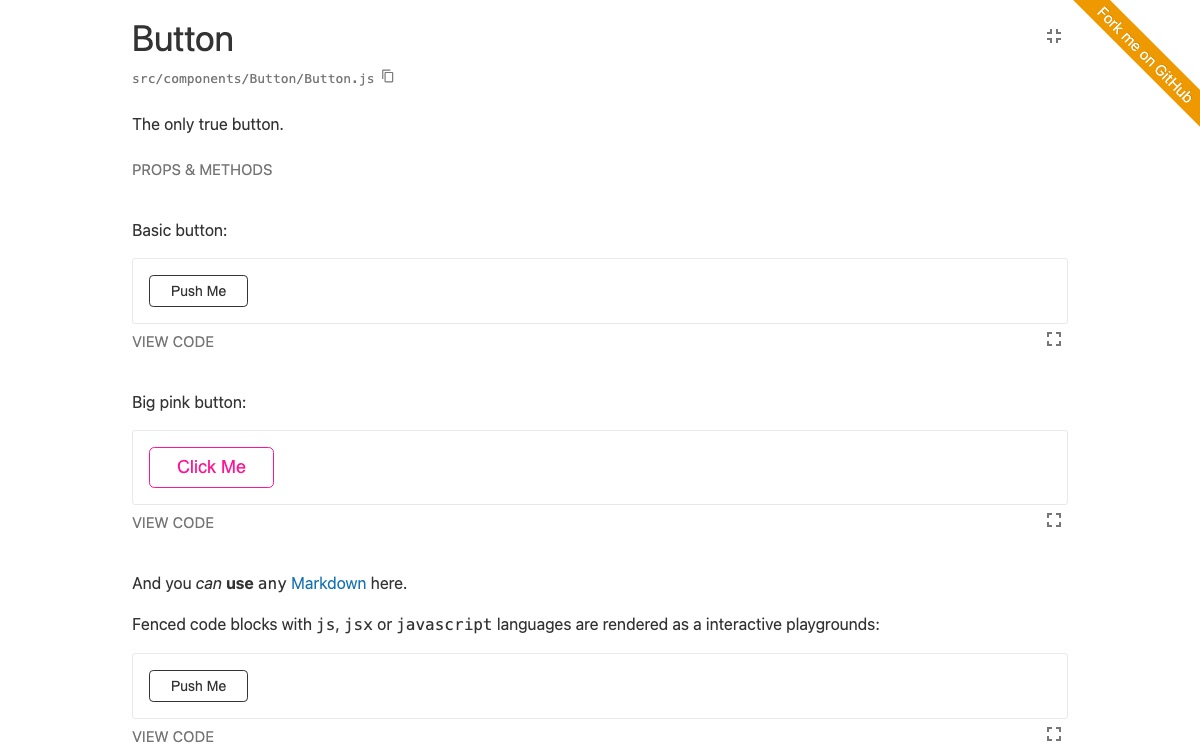
Another important distinction is that Storybook shows only one variation of one component at a time but Styleguidist can show all variations of all components, all variations of a single component or one variation. It’s easier to create a style guide with Styleguidist but Storybook has more tools to develop components (though we’re working on that too).
| Feature | Storybook | Styleguidist |
|---|---|---|
| Component examples | JavaScript | Markdown |
| Props docs | Yes | Yes |
| Public methods docs | No | Yes |
| Style guide¹ | No | Yes |
| Customizable design | No | Yes |
| Extra documentation² | No | Yes |
| Plugins | Many | No |
| React | Yes | Yes |
| Preact | Yes | Yes |
| React Native | Yes | No |
| Vue | Yes | No (Vue Styleguidist, the Vue port, is archived) |
¹ All components on a single page.
² Include non-component documentation.
Are there any other projects like this?
Active
- Catalog, create living style guides using Markdown or React.
- Cosmos, a tool for designing encapsulated React components.
- Docz, a tool for documenting your components with zero configuration and live preview.
- React Storybook, isolate your React UI Component development from the main app.
Inactive
- Atellier, a React components emulator. Last release 2016.
- Carte Blanche, an isolated development space with integrated fuzz testing for your components. Last release 2016.
- React BlueKit, render React components with editable source and live preview. Last release 2017.
- React Cards, devcards for React. Last release 2017.
- React Styleguide Generator, a React style guide generator. Last release 2017.
- React-demo, a component for creating demos of other components with props editor. Last release 2017.
- SourceJS, a platform to unify all your frontend documentation. It has a Styleguidist plugin. On hold.